In the past, the idea of putting the words “creative” and “mathematician” in the same sentence would have seemed out of place. These days though, making sense of complex data requires design skills and number crunching that are as much art as they are science.
If you think this stuff is simply for nerds, you might not be laughing when your buddy starts making $200,000 a year in his new gig as a data scientist. But whoever they are (and however much they get paid), the folks behind 2015’s best data visualizations have done the following things well:
- Used design and/or data science to make insights from a data set easily understood
- Designed a visualization that tells the whole story by itself, meaning it does note need added context to be compelling
- Delivers the data in a way that surprises, startles, or is (totally subjectively) awesome aesthetically
Here are a few of our favorites from 2015. These visualizations were nominated by members of the Visually team, and all powerful examples of data visualization. One of our favorite things is all the diffferent reasons people had for creating these pieces. Whether it was for fun, to aid policy decisions, or do high tech content marketing, this data viz all makes a strong point:
FlowingData: A Day in the Life of Americans
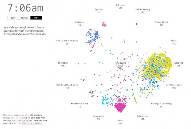
See what the average American is doing with his or her time at any hour of the day in this animated beehive of activity, then question why so many people are still in bed at 8 a.m. They might need a wakeup call.
Vocativ: How Americans Came to Accept Gay Marriage
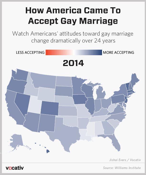
As goes the country goes, so goes the Supreme Court. In light of the high court’s historic ruling in June 2015 in favor of gay marriage, this animated U.S. map is a study in how perceptions have shifted.
The New York Times: The Economic Future
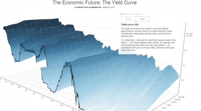
If Janet Yellen spoke in data visualizations, we might listen and understand what exactly interest rates are doing.
WhiteHouse.gov: Interactive Budget
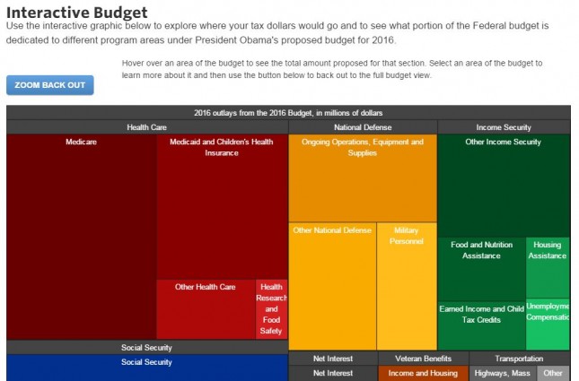
This data visualization is like Jeopardy for policy wonks. View the entire package to see how much federal money is spent on Medicare versus defense, for example, then click any tile illustrating a particular line item to drill deeper.
Google Search: A Year in Trends 2015
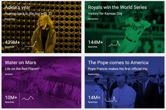
Learn just how many of your friends care more about “Star Wars: The Force Awakens” than you. Then be inspired by search traffic that suggests humanity might have its priorities in the right place after all—we recommend checking out the Nepal earthquake tile.
The Wall Street Journal: Infectious Diseases and Vaccines
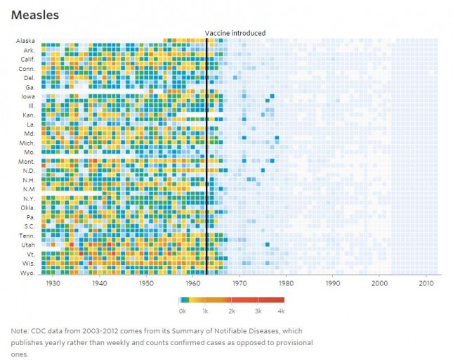
The winner of a Data Journalism Awards 2015 prize, “Infectious Diseases and Vaccines” uses data to show how the number of disease cases have plummeted as a result of widespread vaccine usage. Hover over any chart to see individual figures and a sliding scale of severity on a state-by-state basis.
Caelum Contracts: London Food Hygiene
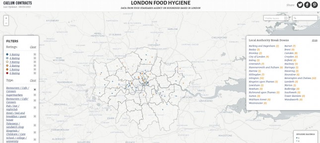
Filter through this map of Food Standards Agency data from London and you’ll discover a massive amount of information about where to eat and which snack stops to avoid across the pond. We especially liked this visualization for taking a public data source and making it useful for the public it’s meant to serve.
FiveThirtyEight: Are Ubers Supplementing or Replacing Cabs?
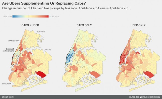
If you enjoy riding with Uber, you’re probably not a taxi driver. These data visualizations create an dramatic heat signature showing where taxi rides have tanked and Uber pickups have soared in New York City.
Big Group: Who Receives the Most Acknowledgements at the Oscars?
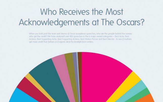
In honor of this awards blog post, we’d like to thank our investors, our bosses, and… is the “wrap it up” music playing already? Then take a few minutes to check out this simple but beautiful visualization of who the best actors and directors thank in their speeches.
(Hi Mom!)
Ahem… Now that you’ve seen some amazing data visualizations why not build one for your next content marketing campaign? Here are some examples.
Or check out the rest of the best visual content from 2015:

The post The 9 Best Data Visualization Examples from 2015 appeared first on Visually Blog.
from Visually Blog
http://blog.visual.ly/9-best-data-visualization-examples-2015/
No comments:
Post a Comment