If there were a gold standard for brands engaging in data storytelling, it’d be Google’s Politics & Elections vertical. Using data collected from millions of Google searches and other user interactions, it regularly publishes infographics that give key insights into the American political psyche. Its data has been used to compare interest in the Occupy Wall Street and Tea Party movements as well as identify the most important issues surrounding U.S. Senate campaigns. Because of its massive datasets and easy-to-understand infographics, its findings have been shared by thousands of social media users and often makes news headlines.
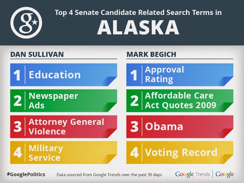
Google turns massive amounts of data into simple visualizations.
With the recent launch of data news sites like FiveThirtyEight, Vox.com, and The Upshot, it seems clear that data storytelling is in vogue, and many brand executives are now asking their marketing teams how they too can tell engaging stories with numbers. But while there’s widespread agreement that there’s value in such content, there’s also ignorance as to what this kind of storytelling entails.
At my visual content company, we’re constantly approached by brands that have a rough outline of an infographic they want created, and they expect that we will simply assign a designer to the project who will bring that outline to life. But in my experience this approach rarely produces an outcome they’re looking for, much less one that social media users will want to share.
Companies are often surprised to learn that storytelling with data is much more difficult than simply throwing some numbers and statistics into a few colorful charts. Here’s a checklist every company will want to consult whenever it’s telling a narrative with numbers:
1. Hire a data journalist
Data journalism is one of the quickest growing fields within the media industry. Not only will a data journalist have a good eye for what is considered newsworthy data, he or she is trained on how to present the data so that it’s clear and easily understandable. Journalists are also qualified to assess the overall accuracy of the data, properly source and reference and ensure that it isn’t misleading to readers.
2. Use quality data
Speaking of data sources, not all are created equal. I can’t tell you how many times I’ve seen infographics that cite unscientific internet polls or pull apocryphal statistics seemingly from thin air. Usually the first thing we ask a brand is what data they have access to, and this helps us determine whether we need to look at outside sources when crafting a narrative. Generally there are three sources we deem acceptable to include in an infographic:
-
Academic studies or official government statistics:
There’s a wealth of academic literature out there that applies statistical rigor to its data. Because many of these papers are peer reviewed, then more often than not their results can be trusted.
-
Internal data:
When a company operates at scale, it often processes millions of user interactions. The trick is thinking of ways to measure these interactions in such a way that produces valuable insights.
-
Commission a poll:
It can be pricey, but hiring a reputable polling firm to survey consumers can produce any number of interesting insights. This helps especially when you’re trying to entice journalists into covering your company; it’s hard for a reporter to resist being given access to exclusive poll numbers. While polling firms are expensive, there are cheaper do-it-yourself options on the market like SurveyMonkey and Google Consumer Surveys.
3. Find data with emotional resonance
We usually think of numbers and math as being cold, not conducive to warm fuzzies, but the best data visualizations are able to produce an emotional response. Think about charts that show incarceration rates for black Americans or global maps of human trafficking and how they’re able to cause empathy by exposing us to harsh realities. Whether it’s happiness, hilarity, sadness, or wonder, a good data visualization will evoke a strong response from the emotional side of the brain.
4. Demonstrate clear takeaways
Some of the worst data visualizations are the ones you have to stare at for several minutes before you even comprehend what they’re trying to say. There should be a swift “aha!” moment within seconds after someone sees your data. Will your readers walk away from it with a slightly better understanding of the world? Will they be able to apply it to their jobs or in conversations with their friends? If not, then you’re not telling a clear enough story and should likely rethink how the data is presented.
6. The data should lead, not follow
Often we see companies with a clear agenda looking for data to support it. At best this could be a lost opportunity, and at worst it could be viewed as deliberate manipulation that calls into question the integrity of the company’s brand. You should start your data analysis with a blank intellectual slate, and follow the narrative that the data shows. Some of the most engaging content comes from data that is not intuitive or supports a surprising conclusion. If you begin with the answer already in mind, you may be missing out on a much bigger or more interesting story.
Matt Cooper is the CEO of Visually, a company that creates premium visual content for businesses via professional creative freelancers and powerful content creation platform. He’s passionate about the latest visual content marketing trends and providing Visually’s community of global freelancers with opportunities to work on unique, cutting-edge projects while having the freedom to live the lives they desire. Follow him on Twitter @matt_cooper and read more from him on the Visually blog.
The post How to Craft an Engaging Narrative with Data appeared first on Visually Blog.
from Visually Blog
http://blog.visual.ly/craft-engaging-narrative-data/
No comments:
Post a Comment