The Visually team is very excited to unveil our new logo. This is a huge step forward for our company — we’ve had the same face since our inception in 2009, and this new rebrand marks the next step in our journey.
To help inspire your brand’s next step, here’s a peek behind the curtain into our design process to see how some of the magic was made.
Why a rebrand?
The Visually team’s mission is to empower every organization with effective, engaging, and beautiful visual content from world’s best creative talent. We’ve grown and evolved so much, we figured it was time to sit down and show our own brand some love.
Bottom line: we produce amazing work day-in and day-out for our clients, so we need to walk the walk, too.
Our old logo — the prism — got us this far, but it didn’t have much of a backstory or meaning to us anymore. To really reflect our brand, we knew we needed to tell a story through our logo. We have a lot to say.
Who are we?
As an organization, we deliver on three brand attributes we hold dear: creativity, uniqueness, and approachability. Since we work with the best creative talent on the market, it was a no-brainer to pull in a designer from our talent community to assist with designing our new identity.
Our in-house designers have been working tirelessly over the past few months to improve our look and feel across all platforms — most notably across our web, marketing, and product presences. This new look improved performance, coincided with some great customer feedback, and was flexible enough to allow for a successful product launch. Updating the logo meant wrapping a bow around our updated brand experience.
We got a better idea of what our logo should look like through hours of research, brainstorming, and sketching. With top talent at our fingertips, we brought in a logo guru from our talent community. Agent Illustrateur, based in Montreal, jumped right in to assist with creating a dynamic new logo that conveys the Visually brand persona.
Evolution of the Prism
We’ve been around for a little while, since 2009 to be exact. Our old logo was a representation of the past, not the future. There was no question that we did have some brand recognition in the creative services space, but since the company has evolved so much, we felt it was time to tell a new story.
We knew we had to get across the three elements of creativity, uniqueness, approachability. Other concepts we played with: clean, colorful, abstract, and geometric. After several rounds of comps, revisions, and redesigns trying to reinvent the wheel, things just weren’t feeling like us:
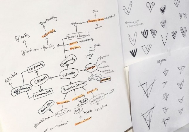
So we figured, why let that brand recognition go to waste? Our old prism didn’t have much meaning behind it, but never fear, our talented designer Agent Illustrator used her conceptual skills to tell a story that really does embody what we do.
![]()
The Silex
A silex is a ground stone or flint, often found in an arrow shape. It’s a metaphor for the devotion, craftsmanship and creativity necessary to make something very useful. It evokes evolution and exploration, refined craft, hitting your mark.
Origami
Paper craft, or origami, is a great complement to the silex idea. “From a simple piece of paper, you can create a whole array of shapes, just by making precise folds. It’s clever, mathematically precise, unique and at the same time, very poetic. It’s like the Visually process – a smart approach where you can take a simple brief and make it a fantastic, out of the box project with some soul,” says Agent Illustrateur.
The final element is a distinctive « v », with the geometric inspiration of the origami and the added details and depth of the silex. The overall, colorful shape remains simple, with a slight asymmetry so it keeps a certain dynamic. The angular shape, paired with a geometric but slightly rounded font keeps it balanced, relatable, and versatile. The new identity also makes a subtle homage to the previous logo with a slight reference to the prism.
![]()
Visually appealing
Bright, modern, and refreshing. As you can see, that’s what we’re going for. What would a killer new logo be without all the fun stuff to go along with it? Fonts, colors, and icons galore! We’re loving our new brand guidelines and with these elements, our brand recognition is sure to skyrocket. We’ve come a long way. The heavy lifting might be behind us, but our rebrand isn’t done yet. Over time, you can be sure that we’ll refine, test, and evolve our brand so we’re walking the walk from here on out. We love our new logo, and hope you do too! Check out visually to see more.
Eddie Shrake is the Senior Brand Designer at Visually.
The post Visually Appealing: Behind Our New Logo appeared first on Visually Blog.
from Visually Blog
http://blog.visual.ly/visually-appealing-behind-new-logo/
No comments:
Post a Comment