Although many companies use data to produce compelling micro content, only a few create content at a depth that puts them in the category of top-shelf content marketers. In this post, we’ll examine several of the best data visualization examples from the brands Think With Google, Castlight Health, KISSmetrics, OK Cupid and LinkedIn. Along the way, we’ll dive into how you can create your own strategy based on techniques adopted by these renowned number crunchers.
1. Think With Google illuminates consumers’ travel decisions
Think with Google produces a ton of great information aimed at helping marketers make sense of the world. Its social team has developed a brilliant approach to communicating insights more effectively: a running stream of snackable Twitter posts that highlight trends in mobile device usage, generational purchasing decisions, travel and more.
As the summer comes to a close, plan for the one ahead with our new interactive dashboard: http://t.co/XLbr7SkQLN pic.twitter.com/oKAHPa9PEX
— Think with Google (@ThinkwithGoogle) September 9, 2015
These two data visualization examples capture all of those impressive qualities, specifically in the travel category. In the post above, information on Google users’ most popular itinerary searches is not only listed out from one through five—it’s also highlighted in a U.S. map tracing those common travel routes.
Meanwhile, the post below illustrates the intersection of travel and mobile-device usage with a bar chart identifying the most common mobile searches about specific travel topics such as hotels and cruises. It also spells out how search volume on those topics has changed over the past year.
ICYMI, see how travelers use mobile in moments of intent: http://t.co/XLbr7SCrDl pic.twitter.com/8nbVJhPmDZ
— Think with Google (@ThinkwithGoogle) September 16, 2015
In addition to being some of the best data visualization examples, these Think With Google posts are effective because they include a link back to Google’s own research on topics of interest to marketers. The simple icons and easy-to-digest fonts of the data visualizations blend with a snappy caption and a backlink to Google’s site, generating valuable returns to the content creator in the form of clickthrough traffic.
Content Marketer Takeaway:
To drive traffic with micro content, build a following of loyal data junkies who just can’t get enough of your snackable visualizations
Would you like to learn more about creating awesome micro content? Download our ebook, The Visual Content Playbook for Social Media Marketing, for tips from top brands using micro content most effectively and actionable strategies you can adopt right now from the Visually creative team.
2. Castlight Health reveals how medical-related searches can save employers money
The genius of Castlight Health’s distinctive searches data visualization is threefold:
- It displays the most popular health searches within its cloud-based network by gender, age and region in an easy-to-read map.
- It engages the reader by inviting them to drag the horizontal slider across the page to see how topical searches change as we age. Users can also hover their mouse over the “i” icons for definitions of search terms that might be unfamiliar.
- The map clearly illustrates the value proposition of the brand, which is to help companies save money targeting spending based on health needs employees have self-identified through search.
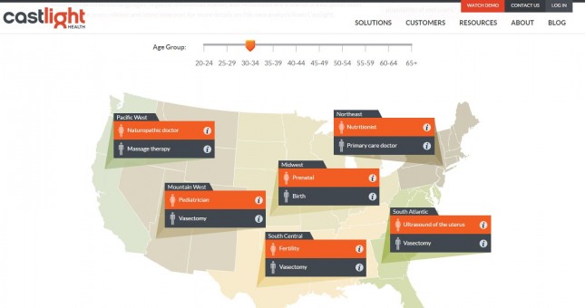
A tempered color palette and fonts that align with the overall Castlight website make this even more of a winning data visualization.
Content Marketer Takeaway:
Think outside the box to create data visualizations that encourage your audience to play while learning about key components of your brand promise.
3. KISSmetrics explains marketing trends with clever illustrated stories
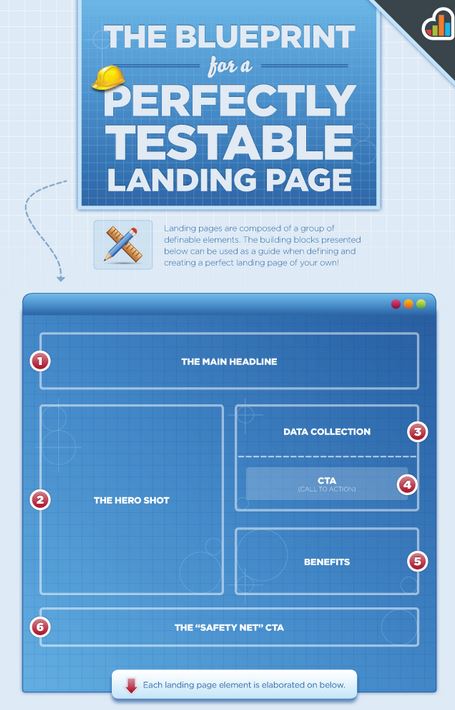
Content marketers are familiar with the unique data treatment of KISSmetrics, which builds out endlessly readable infographics on popular marketing topics. This micro content can best be described as joy-inducing because of its endless creativity.
For example, the infographic below—visualizing KISSmetrics expertise on best practices for landing pages, a topic only a marketer could love—is particularly effective. It tells a story in sequential order using the narrative of a construction site. The treatment includes a blueprint-themed color palette, icons including hard hats and rulers, and clearly numbered chunks of information.
Content Marketer Takeaway:
Create custom illustrations and tutorials that highlight your brand’s expertise in a specific data area while
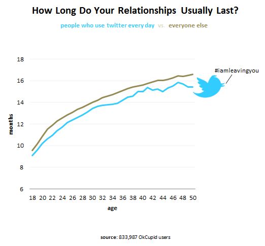
4. OK Cupid makes the salacious presentable with charts on relationships and sex
At OK Cupid, the only bad question is one that isn’t visualized. Its post 10 Charts About Sex includes revelatory (cue Victorian gasps) graphics such as this one, which appears to unearth a connection suggesting high Twitter use general amounts to shorter relationships. Speculate away!
Content Marketer Takeaway:
Shock and awe your audience with data no one else has, and they won’t be able to look away.
5. LinkedIn fuses data with blogging for business insights
In the world of business professionals, few social media platforms rival LinkedIn. So naturally audiences turn to its blog to make sense of trends the network is seeing among its member base.
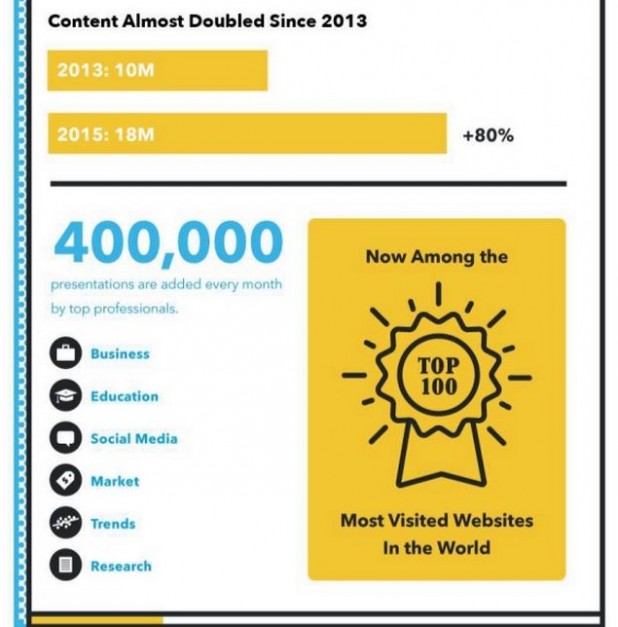
Take the following example, which illustrates the dramatic rise of SlideShare usage in just two years. This is a screengrab from a larger infographic, which is embedded with a scrollbar inside a blog post for easy reading
Of course, SlideShare is a LinkedIn property, so this is another classic case of using data to communicate brand value. It helps that these data are presented in a clear visual hierarchy featuring eye-catching icons and big, round numbers.
Content Marketer Takeaway:
Simple is better when it comes to demonstrating change over time, audience share and brand expertise.
If you’re ready to jet set out of tedium a la Think With Google and slap on a construction hat per KISSmetrics to launch forth into newer (and better) micro content strategy, download our new free guide. You’ll find primers on how to use micro content, see visuals from LinkedIn and other successful brands and discover step-by-step publishing strategies.
Nate Birt is a multimedia journalist, social media enthusiast and copy editor with experience at a variety of print and digital publications, and a Contributing Editor to the Visual.ly Blog. Follow him on Twitter at @natebirt.
The post Five Of the Best Data Visualization Examples from Content Marketers appeared first on Visually Blog.
from Visually Blog
http://blog.visual.ly/five-best-data-visualization-examples-content-marketers/
No comments:
Post a Comment